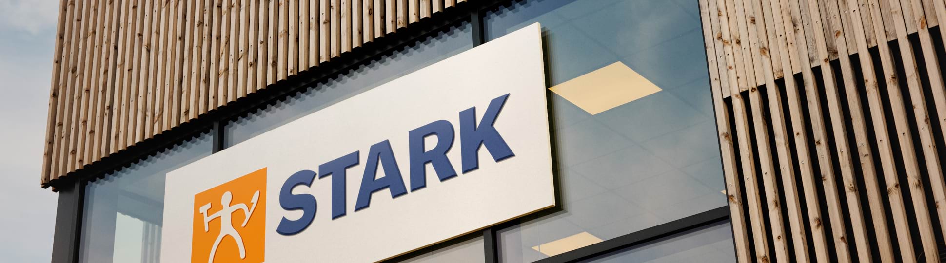
STARK (2024)
STARK: Tweaking the STARK.dk experience
For keeping my portfolio up to date, I decided to redesign two core pages of the STARK.dk website: Search results and filter overviews. As part of the exercise, I also tweaked core navigation components.
General considerations
For the redesign, I have based the visual identity on the STARK Group Brand Guidelines and the current implentation of STARK.dk. As per the guidelines, GT America is the primary font for print and digital. However it is not currently used on STARK.dk and since it is a licensed typeface, I decided to stick with the Roboto versions currently in use. Likewise, for the color palette, I have found inspiration in brand guidelines and the current site.
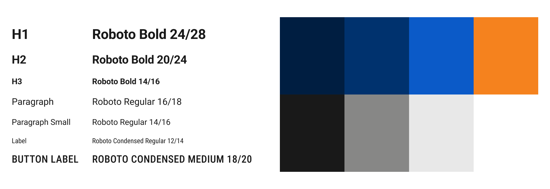
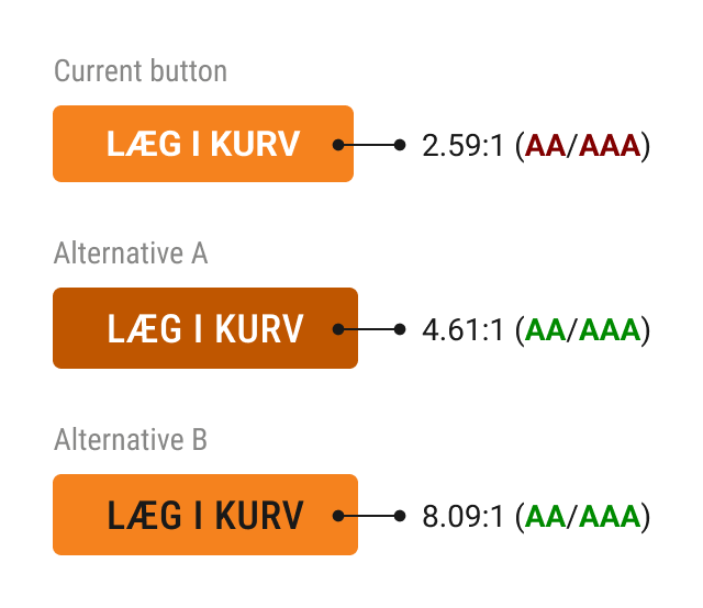
As stated in the brand guidelines, orange "is used primarily as a highlight colour on buttons, call-to-actions and text outlines." It makes perfect sense to align the primary CTA with the defining brand color, but the current buttons on STARK.dk do not meet accessibility guidelines as per WCAG 2.2.
I have listed two alternative versions, both of which live up to the AAA guidelines. The first version (A) is a tinted orange that aligns with the orange/white combination of the logo. The second (B) sticks to the original orange and uses the original black. For the redesign examples listed below, I chose version A but both would work.
Redesigns
When reviewing a website, I typically start with a core component such as navigation. The navigation on STARK.dk is interesting for two reasons: 1) Navigation being a vital component on a commerce site, heavily influencing conversion rates. 2) The complexity of the different functionality (scan barcode, dynamic breadcrumbs and delivery selection).
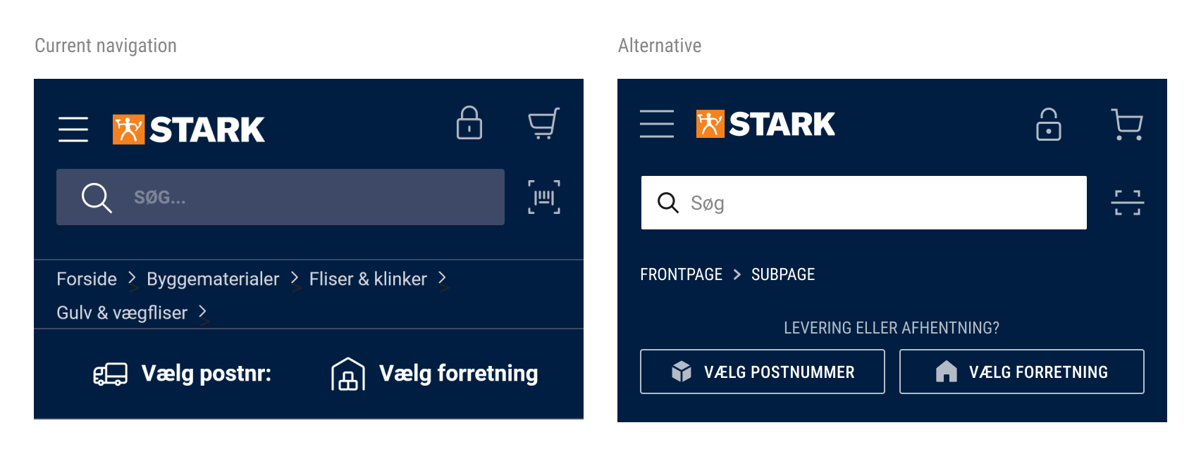
While I have kept the core design principles of the navigation, I chose to improve the contrast of the search field to meet WCAG AA/AAA contrast requirements. As mentioned above, a visible search field is critical on e-commerce sites. Secondly, I have added an explainer text to the bar with zip code/store selection, to ensure that users know why to enter the information.
Please note: The change in icons is purely based on the fact that I do not have access to STARK's icons and had to use a substitute icon pack.
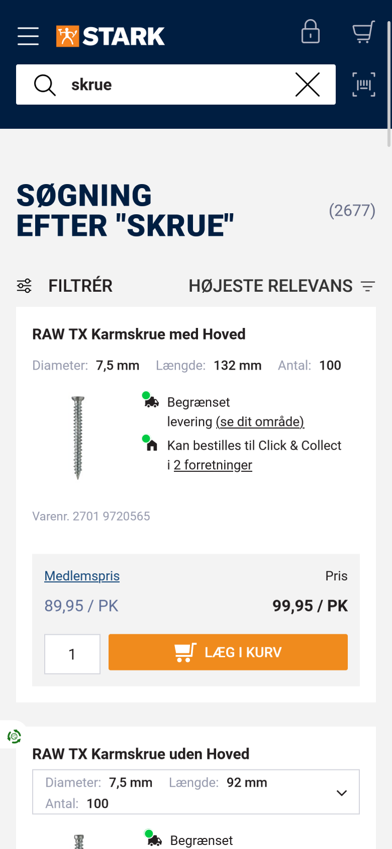
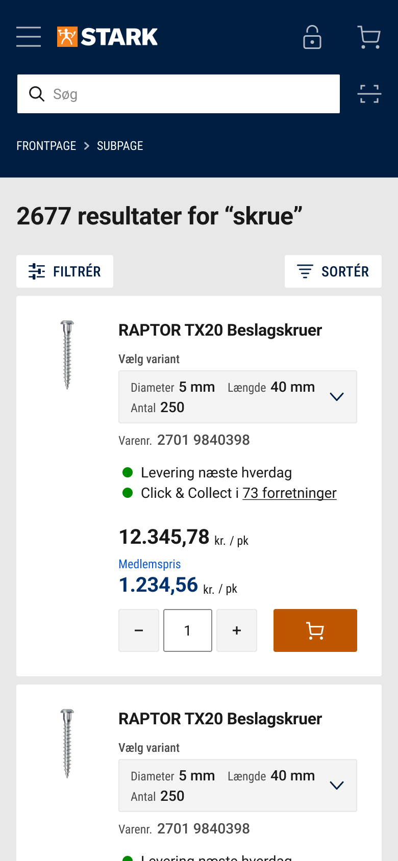
Search results redesign
On the mobile search results page, I have focused on the following:
- Consistent margin within product cards
- Accessible typography contrasts (e.g. "Diameter" label)
- Consistent icon sizing and style
- Improved affordance on variant selection (added label and background color to highlight)
- Streamlined delivery/click to collect explainer text
- Integrated search results counter into headline to improve visibility
- Ensured touch areas are at least 40x40pxs
- Added input stepper for quantity
Use the horizontal slider to see the before/after versions.
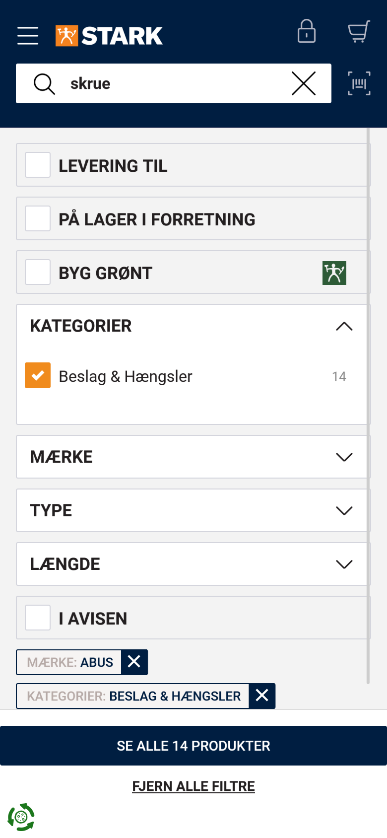
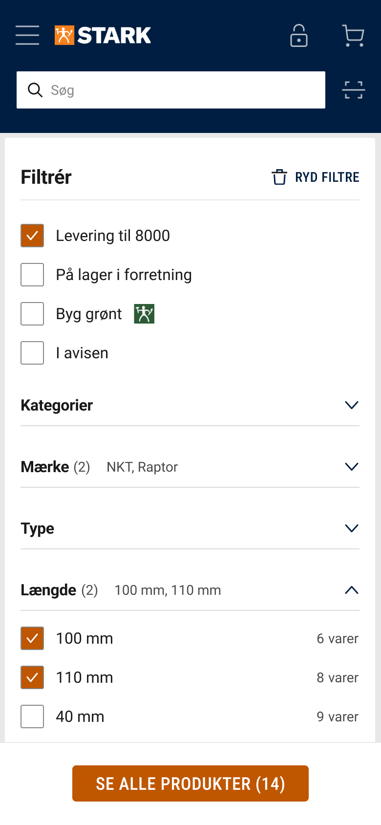
Filter overview redesign
On the mobile filter overview, I have focused on the following:
- Improved visual hierarchy: Categories and underlying filters now have distinct visual style
- Moved all filters without category on top to improve consistency
- Moved "clear filters" button to the top right, to prevent it being clicked by mistake
- Added "selected filters counter" to each category and sorted selected filters on top.
- Changed CTA to follow brand guidelines (orange colour).
Use the horizontal slider to see the before/after versions.